1.Action painting
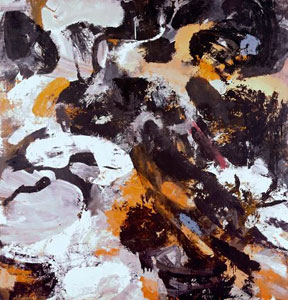
Action painting, sometimes called “gestural abstraction”, is a style of painting in which paint is spontaneously dribbled, splashed or smeared onto the canvas, rather than being carefully applied. The resulting work often emphasizes the physical act of painting itself as an essential aspect of the finished work or concern of its artist. There is closely associated with abstract expressionism.
This style is from the 1940s until the early 1960s. There often drawn between the American action painting and the French tachisme.
The style is a blur and asymmetry.
The American critic Harold Rosenberg coined the term in 1952, and the aesthetic perspective of New York School painters and critics. The earlier critics sympathetic to their cause, focused on their works “ abjectness”.
Over the next two decades, Rosenbarg’s redefinition of art as an a sct rather than an object, as a process rather than a product, was influential, and laid the foundation for a number of major art movements from Happenings and Fluxus to Conceptual . Performance art, Installation art and Earth Art.
2 artirs/design
James Brooks
Philip Guston
2. Digital art
Digital art is a general term for range of artistic work and practices that use digital technologies an essential part of the creative and presentation process.
Sine the 1970s, various names have been used to describe the process including computer art and multimedia art and digital art is itself places under the larger umbrella term new media art.
The impact of digital technology has transformed traditional activities such as painting, drawing and sculpture, while new forms, such as net art , digital installation art, and virtual reality, have become recognized artistic practices.
2 Artists/Design
Ryohei Hase
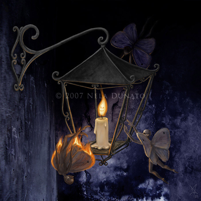
Nala Dunato
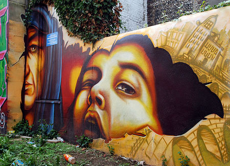
3. Graffti
Graffiti is the name for images or lettering scratched, scrawled, painted or marked in any manner on property. Graffiti is any type of public markings that may appear in the forms of simple written words to elaborate wall paintings. Graffiti has existed since ancient times, with examples dating back to Ancient Greece and the Roman Empire. This style from 1968 to start.Because Because the student protests and general strike of saw Paris bedecked in revolutionary, anarchist, and situationist slogans expressed in painted graffiti, poster art, and stencil art. In the U.S. at the time other political phrases became briefly popular as graffiti in limited areas, only to be forgotten. A popular graffito of the 1970s was the legend "Dick Before He Dicks You", reflecting the hostility of the youth culture to that U.S. president.
The term graffiti referred to the inscriptions, figure drawings, etc. Found on the walls of ancient sepulchers or ruins, as in the Catacombs of Rome or Pompeii. Usage of the word has evolved to include any graphic applied to surfaces in a manner that constitutes vandalism.
Graffiti isms is reflect their resentful. They have lots of idea but no one understand their so they are playing graffiti.
2 Artists/Designers
Banksy
Joe Angert
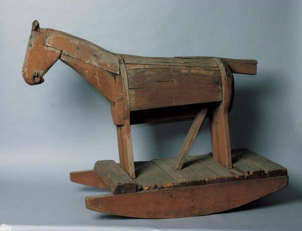
4.Folk art
Folk art encompasses art produced from an indigenous culture or by peasants or other laboring tradespeople. Folk art is primarily utilitarian and decorative rather than purely aesthetic.
As a phenomenon that can chronicle a move towards civilization yet rapidly diminish with modernity, industrialization, or outside influence, the nature of folk art is specific to its particular culture.
2 Artists/Designer
Guy Cobb
Alebrije
5.Neo-Dada
Neo-Dada is a label applied primarily to audio and visual art that has similarities in method or intent to earlier Dada artwork.
The term was popularized by Barbara Rose in the 1960s and refers primarily, although not exclusively, to a group of artwork created in that and the preceding decade.
Dada is an anti-art movement, so the Neo-Dadaists promoted their anti-aesthetic agenda. It didn't hurt that Duchamp happened to have moved from Paris to New York and was sharing his ideologies with artistic peers. Robert Rauschenberg and Jasper Johns quickly picked up on the philosophy of incorporating nontraditional elements in artwork as they began creating collages and assemblages with found materials.
2 Artists/Designer
John Chamberlaim
Kommissar Hjuler
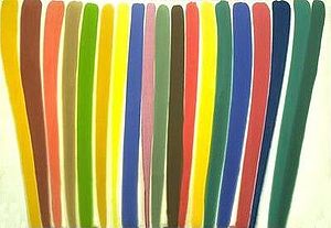
6. Colour Field
Color Field painting is a style of abstract painting that emerged in New York City during the 1940s and 1950s.The movement places less emphasis on gesture, brushstrokes and action in favor of an overall consistency of form and process.
They are using formats of stripes, targets, simple geometric patterns and references to landscape imagery and to nature.
2 Artists/Designer
Jack BushMorris Louis
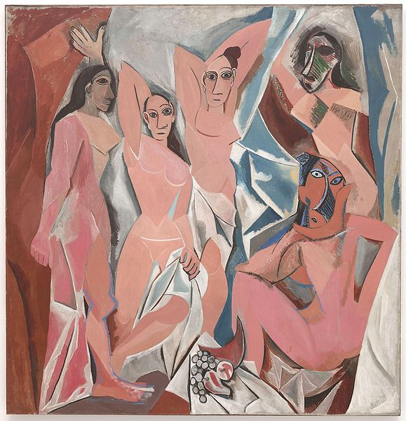
7. Figurative art
Figurative art, sometimes written as figurative, describes artwork—particularly paintings and sculptures—which are clearly derived from real object sources, and are therefore by definition representational.
“Since the arrival of abstract art the term figurative has been used to refer to any form of modern art that retains strong references to the real world."
Painting and sculpture can therefore be divided into the categories of figurative, representational and abstract, although, strictly speaking, abstract art is derived (or abstracted) from a figurative or other natural source. However, the term is sometimes used as a synonym for non-representational art and non-objective art, i.e. art which has no derivation from figures or objects.
2 Artists/Designer
Pablo Picasso
Edgar Degas
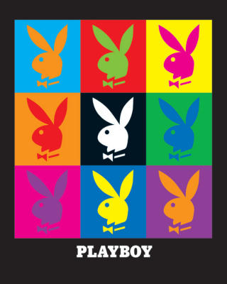
8.Pop Art
Pop art is an art movement that emerged in the mid 1950s in Britain and in the late 1950s in the United States.Pop art challenged tradition by asserting that an artist's use of the mass-produced visual commodities of popular culture is contiguous with the perspective of fine art. Pop removes the material from its context and isolates the object, or combines it with other objects, for contemplation. The concept of pop art refers not as much to the art itself as to the attitudes that led to it.
2 Artists/Designer
Alex Katz Peter Max
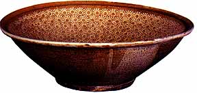
9.Mingei
Mingei is the Japanese folk art movement, was developed in the late 1920s and 1930s in Japan. Its founding father was Yanagi Sōetsu (1889–1961).
The philosophical pillar of mingei is “hand-crafted art of ordinary people” (民衆的な工芸 (minshū-teki-na kōgei?)). Yanagi Sōetsu discovered beauty in everyday ordinary and utilitarian objects created by nameless and unknown craftsmen. According to Yanagi, utilitarian objects made by the common people are “beyond beauty and ugliness”. Below are a few criteria of mingei art and crafts:
* made by anonymous crafts people
* produced by hand in quantity
* inexpensive
* used by the masses
* functional in daily life
* representative of the regions in which they were produced.
2 Artists/Designer
Kawai Tōru
Kawai Akiteru
10.Symbolism
Symbolism was a late nineteenth-century art movement of French, Russian and Belgian origin in poetry and other arts. In literature, the movement had its roots in Les Fleurs du mal (The Flowers of Evil, 1857) by Charles Baudelaire.
Symbolism in art represents an outgrowth of the darker, gothic side of Romanticism; but where Romanticism was impetuous and rebellious, symbolist art was static and hieratic.They believed that art should aim to capture more absolute truths which could only be accessed by indirect methods.
2 Artists/Designer
Albert Samain
Valery Bryusov
Link


